Real World HTML: Navigation
In our last "Real World HTML" entry (a few weeks ago - sorry about that), we implemented the graphic-heavy banner for the site. This time we need to implement the site navigation.
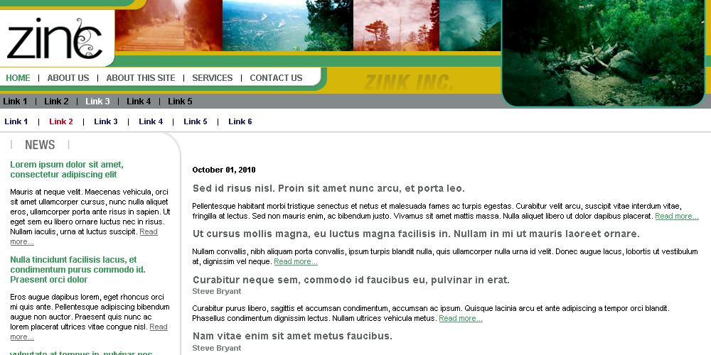
First, let's look at the subsection state of our site, which shows all of the navigation elements present.
Here is the HTML I see for when I look at the three navigation menus on that page:
<ul>
<li><a href="" class="active">Home</a></li>
<li><a href="">About Us</a></li>
<li><a href="">About This Site</a></li>
<li><a href="">Services</a></li>
<li><a href="">Contact Us</a></li>
</ul>
</div>
<div id="nav-secondary" class="nav">
<ul>
<li><a href="">Link 1</a></li>
<li><a href="">Link 2</a></li>
<li><a href="" class="active">Link 3</a></li>
<li><a href="">Link 4</a></li>
<li><a href="">Link 5</a></li>
</ul>
</div>
<div id="nav-tertiary" class="nav">
<ul>
<li><a href="">Link 1</a></li>
<li><a href="" class="active">Link 2</a></li>
<li><a href="">Link 3</a></li>
<li><a href="">Link 4</a></li>
<li><a href="">Link 5</a></li>
<li><a href="">Link 6</a></li>
</ul>
</div>
You could argue (probably correctly) that it would be better to have all of the navigation divs inside a div with an "id" of "nav" rather than have a class of "nav" on each element (a bit of classitis). If I had it to do over again, that would probably be a better way to go. In my defense, I worried that with two menus in the graphics header and one not that they would need to be separated and wouldn't be able to be in the same div. In any event, I don't think this case of classitis is too bad.
I did, however, commit one more sin here to which I should confess. My actual HTML was a fair bit worse than this. Behold:
<ul>
<li><a href="" class="active">Home</a></li>
<li>|</li>
<li><a href="">About Us</a></li>
<li>|</li>
<li><a href="">About This Site</a></li>
<li>|</li>
<li><a href="">Services</a></li>
<li>|</li>
<li><a href="">Contact Us</a></li>
</ul>
</div>
<div id="nav-secondary" class="nav">
<ul>
<li><a href="">Link 1</a></li>
<li>|</li>
<li><a href="">Link 2</a></li>
<li>|</li>
<li><a href="" class="active">Link 3</a></li>
<li>|</li>
<li><a href="">Link 4</a></li>
<li>|</li>
<li><a href="">Link 5</a></li>
</ul>
</div>
<div id="nav-tertiary" class="nav">
<ul>
<li><a href="">Link 1</a></li>
<li>|</li>
<li><a href="" class="active">Link 2</a></li>
<li>|</li>
<li><a href="">Link 3</a></li>
<li>|</li>
<li><a href="">Link 4</a></li>
<li>|</li>
<li><a href="">Link 5</a></li>
<li>|</li>
<li><a href="">Link 6</a></li>
</ul>
</div>
The more technically correct way to handle those vertical bars probably would have been to use background images, but this ended up working very well.
Expandable Background
Most of the CSS isn't actually very interesting - font and color definitions mostly. I am using "text-transform:uppercase" on the primary navigation links so that I don't have to worry about how the dynamic data is formatted.
The one interesting thing, however, is the curved green line behind the primary navigation. Here is the image:
The original width of that image was 456 pixels. I expanded it to 800 pixels wide by expanding the canvas and copying and pasting the straight part of the image until it filled the remaining space. Then I used the following CSS for the primary navigation:
background-image:url(i/nav1-bg.png);
background-position:top right;
background-repeat:no-repeat;
width:456px;
height:33px;
padding-left:4px;
}
The reason for this is that if I need more room for the menu (perhaps because the client asks me to add a menu item) then I can just change the width in the CSS.
An even better way would have been to set width:auto and a min-width and then set padding-left and padding-right so that the div automatically expanded as needed.
In any event, increasing the size of the image took only a few minutes and added very little to the file size of the image but provides me with quite a bit of flexibility going forward.
One other note that I will add is that I generally recommend making the "a" element within a floated "li" to be "display:block". Then you can apply widths, padding, background colors directly to the "a" element instead of to the "li". This is available to the ":hover" pseudo selector in every browser, whereas slightly older versions of IE won't target pseudo selectors to elements other than "a" - causing you plenty of hacky headaches.
That's it for the navigation - nice and easy.
Next up the skeleton of the rest of the site - and a bit more heresy.
There are no comments for this entry.
[Add Comment]