Real World HTML: Columns and Heresy
In our last "Real World HTML" entry (a few weeks ago - sorry about that), we implemented the site navigation. Now we need to finish up the skeleton of the site.
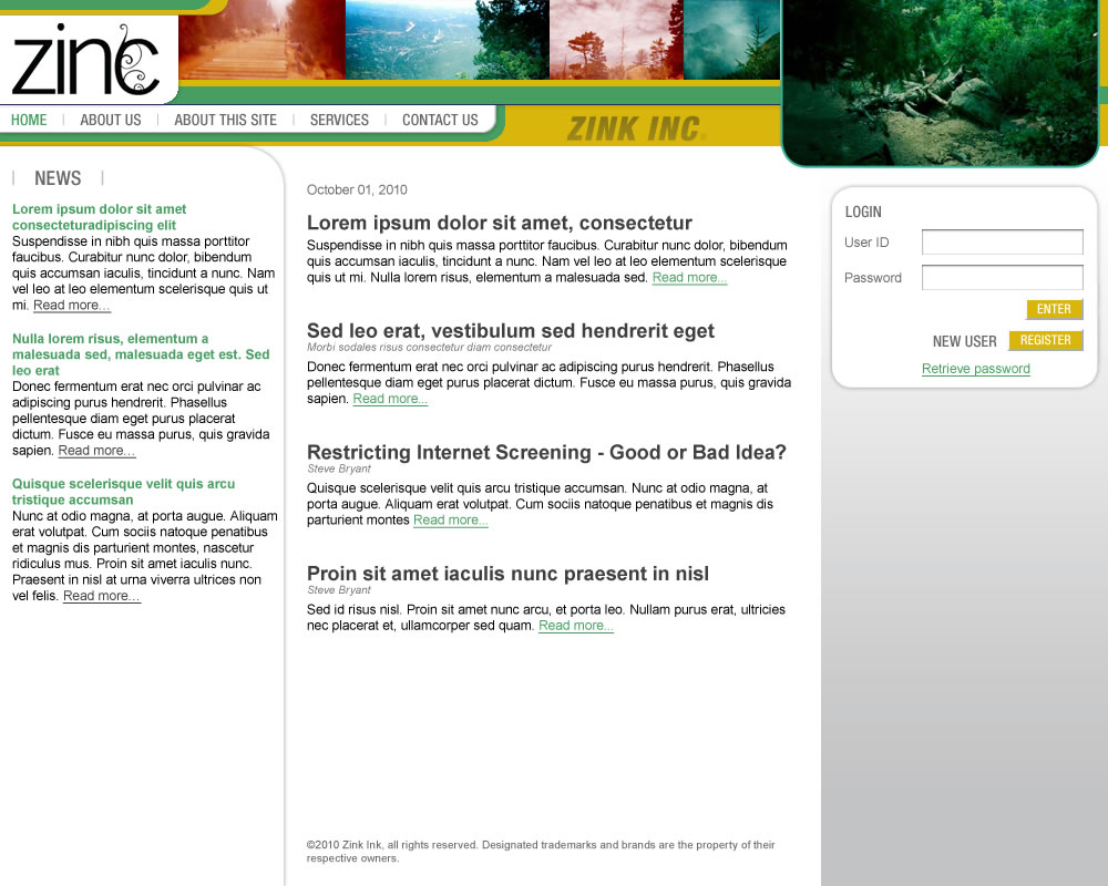
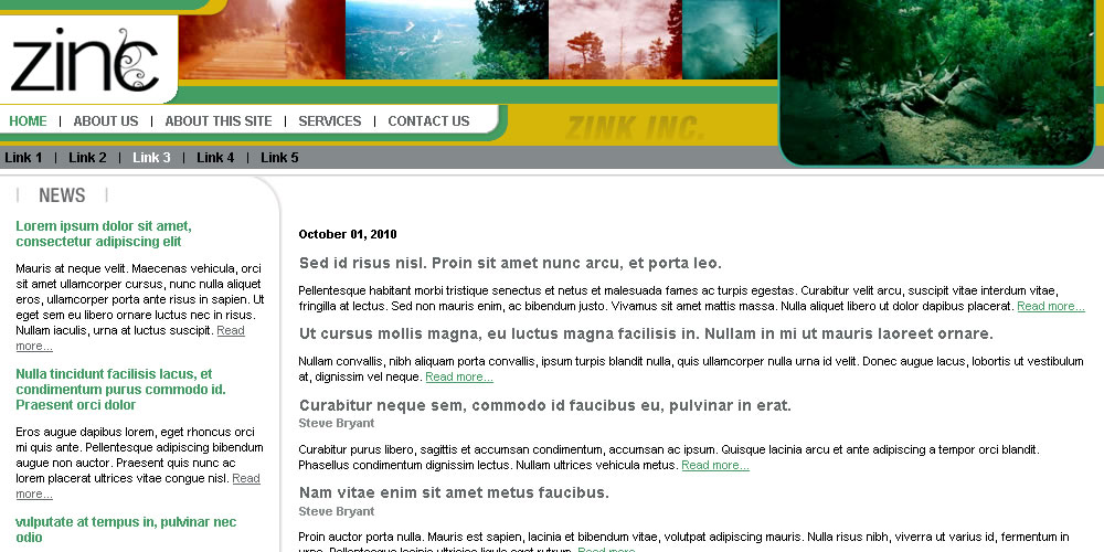
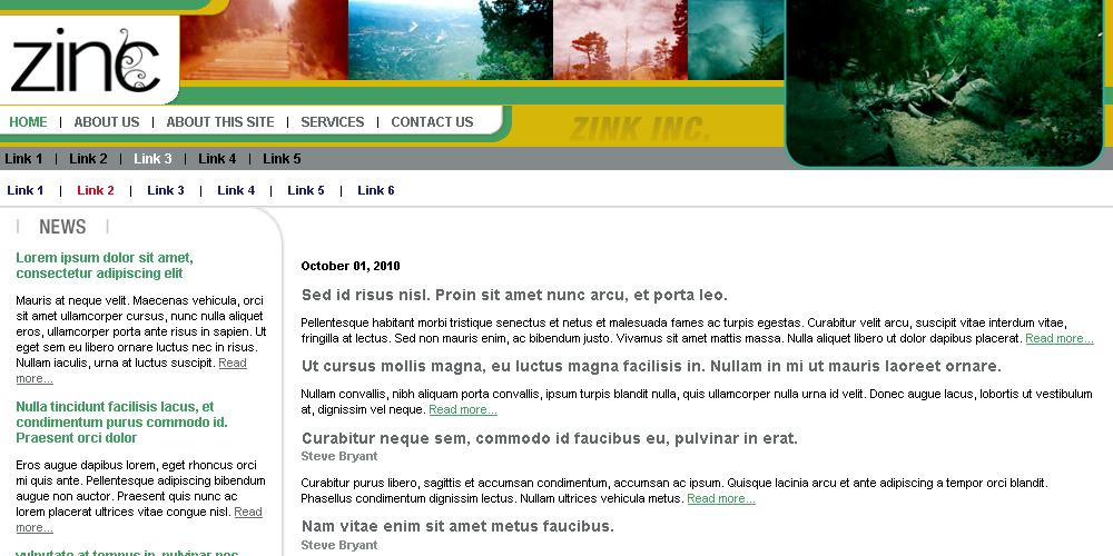
Before we go on, let's review our design in all three states.
Pre-Login State:
Post-Login State:
Subsection State:
The site has a third column on the right only if the user is not logged in. The background for this column extends to the bottom of the page regardless of how much content is in the column. The copyright notice on the bottom of the site lines up with the bottom of both columns regardless of the height of any column, but in no case overlaps over any text.
Imagine how you might solve this problem for a second. The problem seems easy, but each solution presents challenges. Oftentimes, this solution sends people running for JavaScript hacks. This, in my opinion, is the wrong way to go. JavaScript should enhance functionality, not be a fundamental requirement for making the site design work at all.
Absolute positioning and floats are good solutions for many problems, but not for this one.
Instead, I am going to resort to (brace yourself!) tables. More accurately, one table.
<tr>
<td rowspan="2" id="col-news" class="content-cell">
<div id="news" class="cell-div">
</div>
</td>
<td id="body-content" class="content-cell">
<div class="cell-div">
</div>
</td>
<td rowspan="2" id="col-login" class="content-cell">
<div class="cell-div">
</div>
</td>
</tr>
<tr>
<td id="footer">
<div class="cell-div">
</div>
</td>
</tr>
</table>
Now I can style my cells appropriately. I added a div with a class of "cell-div" so that I could set the width of each cell and then add padding within it without worrying about the effects of that on width calculations.
I also took advantage of the "rowspan" attribute of the news and login columns so that those would each extend just past the footer cell and the footer would always remain at the bottom of the page and below any content.
For the price of using a single table, I have avoided the need for any JavaScript, avoided the hassle of worrying with interactions of floats, and gotten my background and footer to line up exactly as I want - all on any browser from the very old to the very new.
It may be heresy, but it is effective.
Here is our site skeleton so far:
<head>
<title>Real World HTML: Example 1 (Zinc)</title>
<link rel="stylesheet" type="text/css" href="/all.css">
</head>
<body>
<div id="container">
<div id="header">
<div id="nav-primary" class="nav"></div>
<div id="nav-secondary" class="nav"></div>
<div id="nav-tertiary" class="nav"></div>
</div>
<div id="body">
<table border="0" cellpadding="0" cellspacing="0" id="body-table" width="100%">
<tr>
<td rowspan="2" id="col-news" class="content-cell">
<div id="news" class="cell-div">
</div>
</td>
<td id="body-content" class="content-cell">
<div class="cell-div">
</div>
</td>
<td rowspan="2" id="col-login" class="content-cell">
<div class="cell-div">
</div>
</td>
</tr>
<tr>
<td id="footer">
<div class="cell-div">
</div>
</td>
</tr>
</table>
</div>
</div>
</body>
</html>
I really think this is the best solution for the problem, but I am will to be proved wrong. If you have a better way, chime in. We will all be better for it.
One other thing to notice about this site. The curved line around "News". It curves around to the left wall, but when the user is logged in, the horizontal portion extends all the way in the other direction to the right wall as well.
Next time we will take a look at that.
It looks really promising, but requires IE to at least be at version 8.
That sounds really interesting. I will have to take a look. Unfortunately, a requirement of IE8 is a non-starter for my clients.
And if floats are "difficult", well... sorry, but this is 2010/1. Tables just don't do anymore.
Perhaps I did a poor job of explaining (likely, sometimes I get rushed on these things).
I agree that a login is on the server-side and doesn't impact the HTML used. If I said anything that implied otherwise, then I apologize for the confusion.
I *do* use CSS. Overly simplified statements like "Table layouts are much harder to maintain and change " really don't take all situations into account. I generally avoid tables, but sometimes using them is actually easier than not. This is one of those times.
The solution you referenced is a poor one for my needs. I have floats (and clearing) within the contents of some of my pages. The clearing would destroy the layout.
I like relative and absolute positioning generally, but this is doesn't handle columns with borders and/or background images that extend to the bottom of the page as well as content that needs to be at the bottom of the page, but not below the side columns.
Most solutions for this would require JavaScript - more of a maintenance issue than one simple table. Or they require CSS hacks - again worse than a single table. The point is that while tables are *generally* not preferred over table-less layouts there are times where they are the best option.
To ignore this in pursuit of some sort of purity of design is ill-advised and a waste of time and effort (in my opinion).
Well, I did manage to do it... for some site back then. I think it was like that:
[container]
--[header etc.../]
--[sub-container]
----[left/]
----[content/]
----([right/] optional)
--[/sub-container]
--[footer etc.../]
[/container]
With the background on the sub-container. This background extends to wherever the contents goes, regardless of where the sidebars end, so you can have "background images that extend to the bottom of the page as well as content that needs to be at the bottom of the page, but not below the side columns."
"Overly simplified statements": nope, that's just my general experience. Doesn't apply to everyone I guess.
Hmm... there's a catch. Oh, yes, the final layout for the above used one sidebar only. So, I don't really know if it would work with two. As for JS: it doesn't use it (this was a requirement, actually, coz that was back in 2005 and my client used IE 6 :( ).
1) That was fixed-width, and your design is variable-width. Hrmm, percentages might do, though.
2) Because it was fixed-width, I had trouble aligning it properly everywhere. It didn't center in IE until IE8. However, that's not a problem for variable-width.
I really meant to cover that approach. It is pretty common (even among CSS experts) and I generally don't like it.
It doesn't solve the curved line nor the gradient (though those are solvable).
You have to have an image that holds the background in the containing element which means that the width of the columns are now part of the background image. This means that if the widths of the columns changes for any reason then you have to change the image.
If the width changes due to client request, this is a pain. Other reasons are downright awful.
If you have a column with slightly wider than expected content then it looks awful. In my implementation, the column just gets slightly wider and the design adjusts accordingly (even the curved line will still hit right).
It won't work with more than two columns on a variable width site because the column width will vary based on the size of the browser window.
I get all of this flexibility on browsers new and old for very little work at just the cost of a single table.
Please take a look at YAML (http://www.yaml.de/en/). With it I've developed loads of great looking websites and webapps with very complex HTML+CSS layouts.
There really is no need for a table these dayz ;-)
Good luck with your series.
I will take a look at YAML. I don't understand, however, why tables are viewed as *always* so bad as to be worth so much trouble just to avoid them.
Don't get me wrong, I do without tables on most of the sites I do. Sometimes, however, a single table solves a lot of problems for very little code.
If the only answer is some ivory tower "Tables are for data" then I have to admit that I don't care about that - to that degree.
Sometimes - sometimes - tables are a really easy way to solve a design problem and one that works on any browser new and old.